Statistics New Zealand has just published the first official regional GDP data, in current prices for the four years to March 2010.
Personally, in feedback to Stats on prioritising economic statistics, I've been rather curmudgeonly about investing in regional data. It's not obvious that a country with just shy of 4.5 million people needs much regional data: we're so small already that breaking the data down into even smaller regional views doesn't make a lot of sense to me. You don't (for example) see geographical breakdowns of suburban GDP in Sydney, even though the Sydney economy is larger than New Zealand's. And I'm still not sure whether the money that went into these regional data wouldn't have been better spent on the gaps in our national accounts.
All that said, there have been strong interest groups (including an important political one) pushing for more regional information, so here we are. And to be fair, they do provide a useful benchmark for planning and policy purposes. Maybe the fact that Auckland generates 35% of national GDP might help change some attitudes to where the wealth of the country comes from.
Saturday 29 June 2013
What's the most intellectual joke you know?
Tyler Cowen's Marginal Revolution blog has picked up on this theme, originally from Reddit - here's the link. Here's an article from Slate where I first came across it.
Thursday 27 June 2013
Still no credit data?
Last December, the Reserve Bank made some changes to the statistics it publishes at the back of each Monetary Policy Statement. It rejigged the actual (historical) inflation statistics, dropping a few and adding producer price indices. It kept the same suite of surveyed inflation expectations. It added three surveys of businesses' pricing intentions and costs experienced. And, most importantly, it added three measures of asset prices - house prices, farm prices, and the NZX50 index of share prices. It was a clear signal of where it thought its priorities needed to be.
I'm baffled, though, why there are still no measures of bank lending. You'd think that with the Bank now looking seriously at controlling the ease with which banks make loans or people get them - 'macro prudential' measures, as they're called, and the theme of a speech by Deputy Governor Grant Spencer today - there would be at least some data included on the likes of private sector credit or lending on housing.
Here, by the way, is the recent history of housing lending: as you can see, lending on housing is picking up (+4.9% year to April) but it is still quite modest growth by the standards of the early 2000s.

.jpg)
I'm baffled, though, why there are still no measures of bank lending. You'd think that with the Bank now looking seriously at controlling the ease with which banks make loans or people get them - 'macro prudential' measures, as they're called, and the theme of a speech by Deputy Governor Grant Spencer today - there would be at least some data included on the likes of private sector credit or lending on housing.
Here, by the way, is the recent history of housing lending: as you can see, lending on housing is picking up (+4.9% year to April) but it is still quite modest growth by the standards of the early 2000s.

And here is total lending to the (resident) private sector over the same period.
.jpg)
Again, it's picking up a bit, but in April was running only +3.7% on a year ago.
Frankly, I'm not too sure what to make of these trends. On the face of it, they rather suggest that recent sharp increases in house prices in some parts of the country don't seem to be accompanied by any evidence that the banks have been opening their doors and saying, "fill your boots"....
Monday 24 June 2013
A must-read biography
Charles Moore's Margaret Thatcher: The Authorized Biography; Volume One: Not for Turning is a wonderful book. As other reviewers have noted, it's not often that, after 758 pages of text, you're left wanting more, but you do. This volume takes us up to the end of the Falkland war, in 1982: we've got the miners, the Brighton bombing, the Anglo-Irish agreement, privatisations, the economic recovery of the UK in the Eighties, and Mrs Thatcher's ultimate decline and fall, yet to come.
It's practically impossible in New Zealand's polarised play-the-man-not-the-ball politics, to say anything that won't be misinterpreted, and while I'm not genuflecting to the grab-them-by-the-goolies-in-the-scrum that passes for literary criticism in Godzone, let me make it clear that in commending this book, I'm doing it because it's a wonderful book, not because I necessarily subscribe to everything that Thatcher did or stood for. As have even the left-leaning UK reviewers.
In the Guardian, Andrew Rawnsley said, inter alia, "He [Powell] mines his sources skilfully without becoming their captive. His prose is more considered and his conclusions more nuanced than his partisan journalism. He is not afraid to address the contradictions and tease out the inconsistencies of his subject. Nor to be critical, sometimes deeply so. The result is to paint a much more multidimensional portrait of Thatcher than the caricature heroine adored by the right or the devil incarnate loathed by the left".
Also in the Guardian, an otherwise rather snarky review says that "After all the eulogies, it is refreshing to read about an odd, driven, believable person – rather than some abstract national saviour or demon".
And in the New Statesman, which scored something of a coup in getting David Owen, a former political heavyweight, to write the review, Owen says, "Good biographies, and this is an exceptionally good one, tell us things we did not know about the life of their subject".
I worked in the financial markets in London (1979-1982) during the early Thatcher years. I was torn between extreme irritation at the woman herself - bear in mind that I'm Irish and congenitally adverse to plummy-voiced people telling us what's good for us, and even more so when we might feel that the plummy voice is an acquired affectation - and admiration for her policies. I gather from the biography that many others felt the same way. At one point her advisers sent her a memo telling her how awful her management of other people was. Read the biography for the details.
And yet. For all that she made my fillings fall out, my ideal politician would be someone who is economically orthodox and socially liberal, and in some respects she came into the picture. As David Owen's review noted, "she was determined not to be easily typecast: she was in favour of abortion, fairly relaxed about sexual conduct and had no hang-ups about appointing or being seen around gay men, many of whom she rather liked". Owen's assessment of Thatcher turns harsher later, but this assessment of her social views is generous, especially (as the review says) Thatcher had been rather disrespectful of Owen's wife.
The biography reveals a lot of things: some have put it down to Moore's semi-privileged access to the source data, and there is that, but personally I put it a lot of it down to his extraordinary diligence in following up with those involved at the time. Who would have guessed that French President François Mitterrand - leader of a country that had made an art form of stymieing other countries' foreign policy initiatives - would have been so supportive over the Falklands? Or that he rather fancied her? And that she was at the least grateful, and arguably fancied him back?
De gustibus, as was said long ago, non disputandum: there's no accounting for tastes. Another strange thing (at least to me) that emerges from the biography is how many people found her physically attractive. You'd have expected that from some people. Alan Clark, the famous diarist, was, predictably, one of them, but as he'd have humped a chair leg if the sun shone on it, his view isn't entirely representative. That said, the reaction was remarkably widespread. It's an interesting perspective: it would be demeaning her to say that she took advantage of her femininity across the negotiating table, but she enjoyed flirting and being flirted with, and had more time for those who played the game than those who didn't. If you've got a mental impression that the Iron Lady was iron-like in every respect, think again.
She was distinctly illiberal in one respect. In all her time, she appointed precisely one woman to her Cabinets. I'm somewhat amused: men are often given a serve for appointing people from an Old Boys' network, but the most chauvinist male has nothing on Mrs Thatcher. There was room for only one woman where she was concerned.
Moore is an ideal biographer - you get just enough of his own opinions and conclusions without feeling he is intruding too much into the picture. This is without doubt one of my books of the year, and likely destined to be one of the classic political biographies.
The incomparable Economist
I've been reading The Economist since the late 1950s, when my father used to bring it home from his job with Ireland's Revenue Commissioners (the Irish IRD). In those days it was printed on a strange greyish paper - whether this was some legacy of British wartime austerity, or a considered design choice in the way the Financial Times was printed on pink paper, or an early eco-friendly use of some recycled pulp, I still don't know - and it looked in general a rather dull affair (though, even then, its graphs were outstandingly clear and useful), and of possible interest only to folks like my father, people who we might today call policy wonks.
I didn't appreciate it at the time, but its editorial message also had little mass appeal back then, as the Sixties and Seventies were the high point of active government macro and micro management of the economy. The Economist's message of free (or at least freer) markets didn't get much of a look-in.
Perhaps because it was so steadfastly rigorous, disciplined, intelligent and professional, and unwilling to tack to the fads of the day or aim to the lowest common denominator (although it has glammed up its paper stock and its overall look), it has gone from strength to strength. Even today, when in many markets any good idea is quickly copied (if not outright plagiarised or reverse engineered) and quickly improved on, there's still nothing like it for the breadth and depth of its coverage of global current affairs. It makes you feel like a citizen of the world to read it.
In a way, it's a drawback that it's called The Economist. I've wished it onto all sorts of folks, and a surprising number of them had always resisted picking it off the magazine rack, because they assumed it would be only about economics. If you're one of them, here's the news: it covers current affairs of all kinds, science and technology, books, business, finance, and, of course, a dose of economics (notably the 'Schumpeter' column). Go and look for yourself here.
I generally read it backwards, starting with the obituary of the week at the back, and then the book reviews, also at the back, before heading for the Letters page towards the front, and in particular the last letter printed, which is normally something witty. And after that I start out from the front and read the whole thing, though I have to confess to moving fairly rapidly through the Latin America and Africa sections.
It's not perfect - there is something between a harmless joke and an ingrained bias in its negative treatment of France (even accepting that there is currently much to criticise France about), and it gives surprisingly little coverage to its Irish neighbour, though again that may be understandable in a magazine aiming at global reach - but overall it continues to be highly impressive.
As time has gone by, and I'm sure you're the same, I've been migrating from hard copy to online publications, and not just because so much online is free: I'm happy to pay my subscription to get through the paywall to good content. But The Economist is different: if I end up with only one hard copy magazine in my hot little hand, the Economist will be it. And that's even after allowing for NZ Post's steadily deteriorating level of service in getting it to me on time.
Two things of particular local interest in the latest print issue (June 15th).
We've been having a debate about the introduction of national standards in schools. On p36 of the print edition, or here online, the Economist notes that (referring to the equivalent policy debate in the US), "The most important question, naturally, is whether tougher standards will lead to better results. In rich countries, school systems with exams based on robust national standards (ie, similar to Common Core [proposed US ones]) perform 16 points better on the PISA test (an international benchmark) than school systems without them, says Andreas Schleicher, an education expert at the OECD, a rich-country think-tank. This puts them half a school year ahead. The effect is larger than almost any other national variable". If correct, why are the teaching unions so opposed to national standards here?
The other thing I noted was in the piece on the retirement of Sir Melvyn King from governing the Bank of England (p45 of the print edition, here online). As I've noted in other posts, there have been various initiatives from opposition parties to change our existing monetary policy, in my opinion for the worse. One of the arguments for change is that what we are doing is passé, and that 'modern' monetary policy has moved on to other, better ways of arranging affairs. As the article points out, however, we did indeed pioneer 'inflation targetting', but far from our regime being an oddity (at the beginning) or a backwater (now), the reality is that today there are 30 inflation targetting central banks. Our approach doesn't look, on that evidence, to be in any way unusual or backward. Quite the reverse: we adopted the right thing early, and stuck with it, and others have seen that it works.
Good data, for free, and easily accessible
In the previous post I quoted some long-run inflation data for New Zealand (the Consumer Price Index in the 25 years to the end of 1989).
It's worth knowing that you can easily do this for yourself, if you are interested in seeing what's happened to purchasing power over long periods of time, or if you are interested in the other major economic indicators, such as GDP or unemployment, though I suspect that how you can is one of New Zealand's better kept secrets.
The answer is Infoshare. Infoshare is Statistics New Zealand's free, online, source of official statistics, where you can get, view and download (in Excel format) a wide range of data.
Here's a very quick DIY guide.
Go to the Stats website. At the bottom right of the home screen there's a section called 'Quick links': the second one down is 'Infoshare'. Click there. You can bypass this indirect route if you like, by going straight to Infoshare here.
You have various choices here in the tabs across the top, the main ones being 'Browse' and 'Search'. By way of example, leave it on the default 'Browse', and click on the + sign beside 'Economic indicators' to expand it. Click on the + beside 'Consumers Price Index - CPI'. Click on the + beside 'CPI All Groups for New Zealand (Qrtly - Mar/Jun/Sep/Dec)'.
And now we get to the guts of it. Up comes a page with two boxes in the middle of it. This is where you choose what data you want (left hand box) and for what time period (right hand box).
In the left hand box, click on 'All groups'. The 'Selected' box just above 'All groups' will change from 0 to 1, showing that you have picked a statistic you want to get. This time round, the way we have got there, there was only one thing to select, but often you will have a range of alternatives and you can select several at a go.
In the right hand box, click on the time period you want. Selecting periods behaves exactly like selecting data in an Excel spreadsheet. If you want to select a contiguous range, select the end period, held down the Shift key, and scroll down to select the start period. If you want to select a number of separate periods, select the first, hold down the Ctrl key, and scroll down to select the others one by one.
Let's find out what has happened to prices since the start of the millennium.
Click on the date at the top (as of today, it's 2013Q1). Hold down the Shift key, scroll down to 1999Q4, and click there.
Last thing: bottom right of the page, there's a box which will currently be showing 'Table on screen', which obviously enough means that when you hit 'Go' (bottom right) the data will show on screen. If you prefer to download the data as a spreadsheet, you can change 'Table on screen' to 'Excel file' (or .csv files for other programmes). Leave it at 'Table on screen', now hit 'Go'.
And hey presto, we're done. The CPI was 836.9 (rounding off a bit) in the last quarter of 1999, and was 1174 in the March quarter of 2013.
You can download the data now, if you like, with the 'Save table' options at the top left, and you can play with the table layout using the 'Edit table' option, also top left.
This was very much a layman's quick guide: there is proper help easily accessible on the site, including 'how to' YouTube videos which you can access from here.
Three final thoughts.
First, Infoshare itself. This is a great free resource. Over the years Stats has been at different points along the 'user pays' spectrum and along the 'easy to use' spectrum. It's settled down at 'a great deal, free' and 'easy to use'. This is terrific, and a tribute to Geoff Bascand, the Government Statistician at the helm, and his very professional team. I've been on Stats' Advisory Committee on Economic Statistics ('ACES') for yonks, and it's been great to see at close quarters how open Stats are to users' needs.
Two, and turning to the substance of the data we just looked at, consumer prices have risen by just over 40% in the past 13.25 years, even in an environment where we have had a low inflation target regime: the average annual rate of inflation over the period was only 2.6%. The conclusion is that even low annual rates of inflation are cumulatively insidious - another reason to be very vigilant about keeping inflation under control and to avoid cockamamie experiments with letting inflation rip.
Three, we tend to forget that inflation is very much a man-made, essentially post Second World War II, phenomenon. Using that same Infoshare enquiry, you'll find that Infoshare has data on the CPI back to 1914. Browse through it, and you find that at the end of World War I, the CPI was around the 24-25 mark, and it was still around 25 at the outbreak of World War II.
The historical record is clear: nothing says inflation is inevitable (or that it's much of a good thing even at low levels, and it's outright damaging when it's high and variable). We can choose to have it, or we can choose not to.
Best not to.
Inflation expectations
Enough has already been said about the 'solutions' proposed in a joint Labour/Greens/NZ First/Mana report to solve a manufacturing 'crisis'. Even the NZ Herald, which can be a couple of Chardonnays left of centre, called it "neither novel nor necessary". And commentators did not miss the irony of the 'crisis' being utterly at odds with the evidence from the latest (May) BusinessNZ/Bank of New Zealand Performance of Manufacturing Index, which showed manufacturing in very strong shape. Indeed, the BNZ economists said, "Compared with previous May results, the 2013 value was the highest since the survey began in 2002". If only we all could have a 'crisis' like that.
The report, in sum, has been deservedly rucked over, and there isn't a lot more to add.
There is one aspect, though, that hasn't really got the attention its should have (and it also cropped up in the Greens' money-printing proposal for 'quantitative easing' to drive the Kiwi dollar down, a proposal they have sensibly discarded).
That's the aspect of what happens when you shift monetary policy from the inflation-targetting regime we've got now, to something else - either an exchange rate stability regime (as in the 'manufacturing crisis' report) or outright devaluation (as in money-printing). And what you're explicitly doing when you go down that route is tolerating a higher rate of inflation.
That would not only be a big mistake, and one that would be very difficult to rectify, but it would also be a waste of an important and expensive achievement.
That achievement is low inflationary expectations. It may sound dry and economist-like, but it's a key bedrock item in running a stable environment for businesses and households.
Consider this: what happened to inflation in the 25 years before the present Reserve Bank and its inflation targetting got underway, in 1989? In the 25 years from the fourth quarter of 1964 to the fourth quarter of 1989, the Consumer Price Index went from 62.51 to 697.24: by the end of this period of madness, prices were more than eleven times their starting level. A basket of stuff that had cost you $50 in 1964 now cost $557.70. The rate of inflation over the whole period averaged 10.1% a year.
What happens in that sort of environment is that people understandably start to hold a strong belief that inflation today is 10.1%, it's been 10.1% for a very long time, and it's going to be 10.1% into the indefinite future. Inflationary expectations get into people's heads, and once they are there, they are very hard to dislodge. It takes a big shock, and a prolonged period of getting inflation down, keeping it there, and showing that you mean to keep it there, before people will slowly being to accept that there is a new norm, and gradually adjust their expectations down.
Every developed economy that's had an inflation problem has had to go through this same sequence: a very tough initial monetary squeeze, ongoing firm monetary policy, and clear commitment to maintaining it, before inflation goes down, stays down, and people believe that it really has come down (they tend not to believe the data at first) and that it will really stay down. Central banks that successfully pull off this trick have what the monetary economics calls "credibility".
One of the advantages of high credibility is that the central bank can deal with any future inflationary problems at lower cost to the economy. If times are good, and businesses reckon they can start raising prices with impunity, a credible central bank can raise one eyebrow and businesses will pull their heads in: they know they don't want to mess with a central bank that means business. A central bank with low or no credibility, on the other hand, will be ignored: it will have to raise interest rates a lot to make people pay any real attention.
Today our central bank has high credibility, won at high cost in the early 1990s. Inflation expectations are low and settled (indeed, if anything, going a bit lower again). And we know this for a fact. In its Monetary Policy Statements, the Reserve Bank quotes a range of surveys which ask people and businesses what they think inflation is going to be (they're in table B, in the data at the back end of each Statement). All of them agree: inflation is going to stay low, and within the Bank's target range of 1%-3%. The one that looks furthest forward, and is therefore the one that probably says most about people's long-term inflation expectations, is the AON Hewitt survey of economists' views of inflation four years ahead. It's expecting inflation of only 2.3% a year. Even if you don't believe the economists on this, other people feel the same way. The Reserve Bank's own survey of inflation expectations in the business community expects only 2.1% a year inflation over the next two years.
Having spent so much time and effort to get to this settled, stable place, why on earth would you even threaten it, or, worse, throw it away?
Sunday 16 June 2013
Arbitrage
Been to your local supermarket recently?
You'll see signs along the lines of, "You can only buy six cans of infant milk powder". In our local store, you can buy precisely one tin of goat milk infant formula at a time.
I can be convinced otherwise on the facts, but usually I (and, I'd like to think, most market-friendly economists) have to be dragged kicking and and screaming to subscribe to a "market failure" explanation of anything. Markets are normally very good at solving allocation problems. So this (on a normal reading) is a rather bizarre outcome. You can buy tins of baby milk powder at your local supermarket, send them off to friends and rellies in North Asia, and make a profit.
Arbitrage - the process that says, the same things out to cost the same everywhere, net of transaction costs - isn't working effectively. Well, it is to some partial extent - obviously, people are swooping on their their local supermarket to clear the shelves of stuff that is valued more highly elsewhere. But they have not succeeded in fully closing the price difference.
Why is this happening?
Three thoughts.
First, the person in the street doesn't normally find these sorts of arbitrage opportunities. You can imagine smart financial institutions, for example, exploiting minute differences between the forward price of the Swiss franc in different marketplaces. But you don't expect big opportunities on your local high street, where anyone can put a jar in a bag and post it off for a profit. From that alone, you can infer - and without subscribing to the know-nothing 'markets don't work' view - that there is something strange going on in this market. Something on the supply side of the market doesn't seem to be responding to high demand.
Second, why do the supermarkets care? Why are they doing this? If I was running a store, and there was massive demand for one of the products I stock, I would be saying to my wholesaler, I'll take everything you can send me. I wouldn't be rationing it (let alone rationing it in such an easily circumventable way). I'd be saying, come here and fill your boots.
Maybe there's some sort of social responsibility thing going on - if we send all the baby formula up to Asia, what will Kiwi kids live on? - or some sort of resistance to setting a market-clearing price on the shelves (fear of being perceived as profiteering?), or, more plausibly, it could be that stores don't like to have empty spaces on the shelves. When one of your selling points (as against, for example, the standalone butcher or greengrocer) is that you've got a full range, it's not great to have a big blank on the baby food shelves. You'd think that the supermarkets have every incentive to sell as much as they can, if they can get hold of it.
Three, however you get there, you are left with the idea that there is an extremely lucrative market in Asia, that local suppliers have been slow to capitalise on. There could be good reasons for this, and usually when you look at any reasonably competitive market, your best bet is that businesses do what they do because it's the most efficient thing to do. It could be (for example) that existing capacity is tied up with long-term contracts that don't easily accommodate diversion of production to new markets that have proved to be extraordinarily profitable.
On the other hand, I've just read that Fonterra is taking on the contract manufacturing work for Heinz's infant formula brands, as it wasn't cost effective for Heinz to keep on manufacturing them in the UK and shipping them from there to China. That doesn't sound like there's a capacity problem.
So, you wonder. If you and I can make a quick buck sending milk powder north, why aren't we seeing the big players coming in and doing it for themselves?
Another benefit of greater competition
By way of context and intro, "non-tradables" are things which don't face any real competition from imports. The cost of a hairdresser or a vet, school fees, the local authority rates, electricity prices, and the cost of many government services, are all non-tradables.
So: from the Reserve Bank's June 13 Monetary Policy Statement (p4):
"Non-tradables inflation has also been softer than anticipated. For the most part, this is a result of increased competition among providers of mobile and broadband services, which has resulted in significant declines in the communications component of the CPI [the Consumer Price Index]".
I dug out the actual numbers. In the year to March '11 the prices of what Statistics New Zealand calls 'telecommunications services' were almost unchanged (down by a tiny -0.1%), but in the year to March '12 they dropped by a substantial -7.7%, and in the year to March '13 they dropped by a further -7.2%.
It's not always possible to put a finger on the precise benefits from businesses having to compete harder for your custom with their own networks and infrastructure. In this single sector, increased competition has had a pay-off large enough to affect the national cost of living.
And it makes you wonder what the pay-off would be from a step change in the level of competition in other important but relatively sheltered sectors, notably education and health.
Wednesday 12 June 2013
Pierre Mauroy
Pierre Mauroy, French Prime Minister 1981-84, died last week, and there were nice tributes from across the French political spectrum.
Variously described as France's first Socialist Prime Minister, or at the least the first Socialist Prime Minister under the Fifth Republic (i.e. since 1958), Mauroy was recognised as a real person, with a large and approachable personality, who had paid his dues in the gritty left-wing politics of northern France, unlike the slick management school types who succeeded him. And he was responsible for some admirable initiatives that have stood the test of time, most notably in championing the abolition of capital punishment in France. You could well add extension of the national health service to more people and for more procedures, and you might possibly add some decentralisation measures in a country that was, and is, pretty tightly run from Paris.
You have to acknowledge the personal qualities of the man, and you have to recognise that in much of what was to happen next he was President Mitterrand's agent rather than the prime mover himself. Indeed, he was very much under the thumb of Mitterrand and Mitterrand's appointed minders. It's also the case that pre-Mitterrand's election Mauroy was personally keen to avoid the degree of rupture with free markets that the more radical Socialists wanted, and went on to see introduced.
All that said, you'd also have to say (though the French obituaries haven't) that the French economic rot either started or accelerated on his watch. Many of France's current fiscal and competitiveness issues either got underway, or took a decisive turn for the worse, during his term of office. Widespread nationalisations - this at a time when privatisation was about to sweep through the rest of the western world - a lowered retirement age (to 60), paid holidays increased to five weeks, the workweek reduced to 39 hours (a precursor of the later Socialist move to 35 hours), big rises in the minimum wage, in pensions, in family allowances, and all done without any apparent appreciation that loading extra costs on this scale onto French businesses affected their ability to compete internationally.
When the French economy, understandably, wilted under the burden - unemployment rose, inflation hit 12%, the then French franc had to be devalued - Mauroy was forced to change tack and bring in what we would now call "austerity" policies, some of them realistic (shutting down uneconomic state enterprises), some of them (as nationalisation had been) anachronistic at the time they were implemented. Wage and price freezes had done their dash in both the US and the UK by the late 1970s: reaching for them in the France of the 1980s was, simply, out of touch. And Mauroy was replaced when his drive to curb private education got up the noses of even the usually public-sector-friendly French.
It makes you remember that policies, and politicians, matter, and especially at critical periods. New Zealand was especially badly served by having an economically inept set of policies and politicians at the helm when OPEC 1 hit and the UK joined the then EEC, and again when OPEC 2 hit. I can't help feeling, despite the understandable tributes within France, that the same is true of Mitterrand (in particular) and, sadly, to some degree of Mauroy, too.
Tuesday 11 June 2013
Well that's settled then...
Headlines: from today's Yahoo! NZ site: "Treasury cleared over Solid Energy collapse", and from the Dom, "Solid Energy strategy contributed to downfall - report", both saying that the big message is that Solid Energy was the creator of its problems.
From today's NZ Herald's site: "Treasury not fast enough on Solid Energy - review", and from the NBR, "Treasury could have made more forceful Solid Energy response", both saying that the big message is Treasury's inaction.
Fair enough: opinions make markets, and a diverse range of media is an asset, not a complication. But you sometimes feel that if the sun didn't rise tomorrow, some media would run with "Treasury fails to forecast end of the world".
Saturday 8 June 2013
A cunning plan...
In many industries, consumers rely on effective infrastructure based competition. Or to put it in plainer English, if you're going to get a good deal on your mobile phone service, or on your internet service provider, or on your airline, or on your pay TV, or your car ferry, or on your cataract operation, or on many other things you might want to buy, you need to be able to choose between companies that have rolled out their own equipment on the ground. Without their own gear actually deployed, in many industries companies can't compete for your business effectively.
There is an argument, and often enough I can go at least part of the way along with this, that incumbents don't actually need a real competitor on the ground, in order to be disciplined to offer you a fairer deal. The buzzword here is 'contestability': if a market is 'contestable', meaning that new entrants can give it a go without too much bother, then incumbent rip-off merchants can't push their luck. If they do, grossly excessive prices and profits will attract new entrants, the last thing the incumbents want. So the incumbents will set their prices at some sort of less-than-screw-you-over-completely level, and we're all sweet.
Sometimes, this isn't a bad description of how the real world can operate. Contestability - the threat rather than the actuality of competition - may well figure into the the strategic planning of any incumbent with market power, and in their own enlightened self-interest, they might well figure that a better deal for their customers today might well be worth more to them in the long run than facing an aggressive battle for the market with a new entrant competitor.
The mere threat of competition, we can probably agree, can help keep powerful incumbents constrained to some degree. Fine. But is the threat as effective as the reality? Almost certainly not. Someone actually deploying planes or trains or ships or optical fibre or hospitals or web servers or power stations, and buying advertising time in the media and signing up customers - now it's game on. The incumbents had better sharpen their pencils, because if they don't, the new entrant, and the consumer, win.
This is all in the realms of Microeconomics 101, and to be honest you wouldn't need any course in economics to figure it out for yourself.
In the light of all of this, you'd think that, if a government was looking at a market where there were concerns about ripoffs, the one thing they would absolutely want to ensure was (at a minimum) the 'contestability' of the market. All of which makes the following news, which I've only just come across, so difficult to understand.
Here's the news: it relates to something that originally happened back in 2002, but has now become topical again. And it's about the long running issue of opening a second big airport in Sydney.
The incumbent Sydney Airport is desperate to avoid having a second major airport in Sydney, for, you might well think, obvious protect-its-monopoly reasons. The Airport, though, says it has legitimate reasons. Its chief executive recently said that there's no need for a second Sydney airport, as, suitably rejigged and improved, the existing airport can handle all the projected increase in demand. In any event, he said, as reported here, and which I didn't know until he said it, was ''remember, when the time comes for a second Sydney airport, we hold a first right of refusal to develop and operate it". And when I checked it out, I found that the airport's chairman had said the same thing earlier: Sydney "has first rights to operate a second airport within 100 kilometres of the CBD".
As the young folks say when texting, WTF?
Let me be upfront here. I don't have the time or inclination to fully explore the history of what looks like a bizarre policy decision, but I gather that the right of first refusal came as part of the overall package that the Australian Government offered to bidders when it sold Sydney Airport in 2002, and which one Australian travel journalist last year described as "an almost unbelievable lapse of judgement by the Howard government, which negotiated that clause".
That assessment sounds right from a competition and consumer perspective, although the Howard government very likely benefitted in dollar terms from doing what it did. Selling the airport with a monopolising provision attached probably helped to jack up the price the government got (A$4.2 billion, higher than initial estimates) compared to selling it with the prospect of a future competitor in its bailiwick. It's not the first time a government has gone for the money with an asset sale, and banked the higher price you can get for selling off a monopoly.
I suppose you could argue that the taxpayer didn't lose from all of this. The taxpayer benefitted from the high sale price and the paydown of government debt with the proceeds. You could argue that the public got a lump sum, up front, that compensated them for the likely price exploitation later on.
And it's even possible that these pre-emptive rights that Sydney Airport were given were actually part of some bigger regulatory compact (Sydney operates with curfew limits, for example), and that airlines and the general public got some compensating benefit (less noise at night, say) that might have justified this entrenchment of Sydney's market power. It's possible that the knackering of potential competition was worth enough to Sydney Airport for them to have offered some compensating value to its customers, or was fair compensation for other regulatory requirements.
"And then", as George Orwell once said, "you wake up".
Or to go back to the economics again, what you get with this sort of deal is the total loss of the 'dynamic efficiency' benefits of competition. Even if you believed (and it's a stretch, in my opinion) that citizens got enough in the sale price to pay them upfront for being exposed to the pricing and service behaviour of a monopoly, that is a static view. It ignores the innovation and service benefits that the public and the airlines would have got, over time, from two airports competing for their custom.
And if you want to see a real-life example in the industry, look at the budget airlines in Europe and America. Much of their advantage over the incumbent airlines came from a radically different business model, but they were also helped by being able to get good deals on landing charges from smaller, secondary airports. That's the sort of consumer-friendly industry change that you forego when you sign up to Baldrick-style "first refusal" plans.
Thursday 6 June 2013
Some more business opinion surveys
As I've posted before, I'm very keen on the information that can be gleaned from business and consumer opinion surveys: they start with some simple questions but generate sophisticated information about what's happening in an economy.
In most countries, including here and in Australia, they're generated by the private sector, but some governments have also embraced them, notably France, where the statistics office INSEE has a suite of long-running ones.
Here are some recent examples. Below is the latest (May) survey of business opinion in the services sector in France (just by way of illustration - you'd get the same sorts of results from INSEE's other sectoral surveys).

This is interesting in itself as a snapshot of the current state of the economy - you can see the weak state of things in France, which will come as no surprise - but it also shows something more permanent. In France, as in other countries, businesspeople tend to be generally more optimistic about their own businesses than they are about the economy as a whole (the 'general outlook' line tends to be well below the two lines about what's happening to the respondents' own and expected activity).
Here are the longer-term numbers.
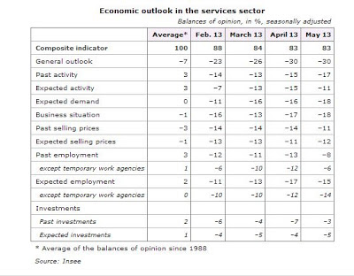
On average (over the past 25 years) French businesses tend on balance to be mildly negative (-7) on the general outlook and on the 'business situation' (-1) but mildly optimistic about their own past (+3) and expected (+3) activity, as well as on their own employment and investment intentions. You could well read into this that French businesses have little time for the idiots at the wheel in Paris, but are carrying on regardless as best they can.
If you think businesses' scepticism about the French economic environment is high, wait till you see what the person in the street thinks. Here's the data from INSEE's May consumer confidence survey.

On average, over the past 25 years, French households have rated the 'general economic situation' as dire, with a net balance of -43 (equivalent to 28.5% of respondents rating it good, and 71.5% rating it bad). And they're currently reporting it as substantially worse again, with a net balance of -79 (equivalent to 89.5% downbeat, and 10.5% upbeat). Interestingly, you can see one of their responses - they're planning to save more than usual (+30 now compared to the long-term average of +18), partly because they are overwhelmingly convinced (+81) that unemployment is going to get even worse than its current 10.6%.
If you haven't fossicked around in these opinion surveys, give them more of a go. They're invaluable for getting a sharp insight into the state of economic activity.
How to read the futures market pricing
I mentioned in a previous post that the financial futures market is picking a modest rise in the 90 day bank bill rate by this time next year.
From time to time you might like to know how to look this up for yourself: it's always useful to know where the financial markets think interest rates are going. They may not prove to be right, but they do give you the best stab at the most likely outcome that you're going to find. Here's how to find it.
First, go here- it's the page on the Sydney Futures Exchange (SFE) website that shows the current prices being quoted. Below, I've got a snapshot of what you'll find: it shows yesterday's prices from that page. I've circled the 'Last trade' column, which is the one you want.

You'll notice that there doesn't seem to be anything here that looks like the current bank bill rate (2.64%): all the prices quoted are in the high 90s. The trick is - subtract the prices you see from 100.
Example: the 'Last trade' for the December 13 futures contract was at 97.25. Subtract this from 100, and you get 2.75. Voilà - 2.75% is the futures market's best current guess at where the 90 day bank bill rate will be in December '13.
You can also do the same thing for Australian short term interest rates here.
If any of these links go down, by the way, you can also find them by going to the ASX homepage (the SFE is part of the ASX), clicking on 'Prices & Research' (top left of the page), clicking on 'ASX Futures' (at the right of the line of tabs going across the page), and up will come a page showing all the contracts traded. Click on the contract you're interested in - Aussie banks bills are on the left, NZ bank bills towards the bottom right - and up will come the page I've snapped above. The same 'subtract from 100' method applies to all the interest rate contracts (but not to commodities, where the expected price can simply be read off directly).
You can also see, by the way, that the futures market has a view only out to about 5 or 6 quarters ahead: the volume of contracts traded (shown in the column second from the right) drops off for September '14, and there were no trades at all on dates beyond that.
It won't give you forecasts way into the future - probably no great loss, as I'd wonder how accurate they'd be that far out - but within its limits it's a very good insight into the most likely near-term track for interest rates.
Wednesday 5 June 2013
The ANZ's latest Business Outlook
I was waxing lyrical yesterday about the great utility of the longer-running business opinion surveys to anyone interested in getting an up to date feel for what's happening in the economy and what lies around the corner in coming months.
As it happens the ANZ's latest Business Outlook survey (for May) came out as I was writing, and it was essentially good news all round. Some of the (seasonally adjusted) measures dropped a little compared to April, but that doesn't matter - the overarching picture is a good one, as you can see for yourself if you follow the link. Firms' expectations for their own activity levels - the key indicator - were high across all the sectors of the economy; firms are planning on investing (farmers were especially on building up the livestock herds) and on hiring; and profitability is good. Exporting is okay rather than brilliant - understandable, given the high Kiwi dollar, the so-so state of the Australian economy, and the weakness of the Eurozone - and inflation is under control. Firms aren't planning on big jack-ups too their own prices, and they aren't expecting inflation elsewhere in the economy, either.
That said, businesses also believe that, while there isn't much of an inflation issue, the Reserve Bank's next move will be to raise interest rates, and they're very likely right. It's probably not going to be a big move, though. The financial futures market, which essentially makes forecasts of where the 90 day bank bill rate is going to go, expects the 90 day rate (2.64% at the moment) to be just over 3% in a year's time, which would be consistent with one, maybe two, 0.25% increases in the Bank's official cash rate over the next year.
Tuesday 4 June 2013
How such simple questions create such great data
Here's a graph from the media release that accompanied the most recent (March) Quarterly Survey of Business Opinion from the NZ Institute of Economic Research.

As a potted history of the recent performance of the New Zealand economy, it's hard to beat. At the left, you can see the impact of the tough monetary policy that followed the setting up of the Reserve Bank in its modern form (in 1989), as well as the initial impact of the 'mother of all Budgets' (1991). And so it goes - good times in the early to mid 1990s, the Asian crisis of 1998, better times in the first half of the 2000s, the GFC, and gradual recovery since.Currently, for example, you can see that Auckland and Christchurch are where it's all happening, with the rest of the country not quite as strong.
The amazing thing is that this wonderful data is all based on the most simple of techniques - as the NZIER says, "Each quarter we ask around 2500 firms about whether business conditions will deteriorate, stay the same, or improve". The net balance (the percentage expecting improvement less the percentage expecting deterioration) is what you see in the graph. A simple up, down, sideways question generates a terrific picture of what's happening in business and in the economy.
And in saying that it's such a simple question, I don't mean to belittle or diminish the value of what the NZIER do. They've been doing this since 1961, and as they say, and I agree, "The responses yield information about business trends much faster than official statistics and act as valuable leading indicators about the future state of the New Zealand economy". I'm not surprised that they keep the bulk of this valuable material for their subscriber membership (there's a whole slew of other data on both current and anticipated developments in the economy in the QSBO, not just the one I've pictured).
As a business resource, these sorts of business opinion surveys are highly useful. The official macroeconomic statistics are of course necessary for many purposes, too, but these opinion surveys are timely, generally on the button in the sense that they are capturing underlying realities, and include more squishy qualitative things (states of confidence, expectations about future events) that tend to be a more difficult area for statistical agencies to enter.
If you're not yet in the habit, give them a go. If you're a NZIER member, then you can consult the oracle at source. If you're not, the monthly ANZ's Business Outlook (formerly the National Bank's business opinion survey) is free and and highly informative. The ANZ folks say (and again I agree) it is "a key leading barometer for the economy. It relies on the input of New Zealand businesses and this input has proven to be very adept at picking economic developments". In particular it includes businesses' expectations for profits, which I always regard as a bellwether of how things are likely to go.
You should also have a look at the BusinessNZ/Bank of New Zealand Performance of Manufacturing Index (PMI) and Performance of Services Index (PSI), which do what they say on the tin. You can find them here at the BusinessNZ website or you can subscribe to have them sent to you by the BNZ here (the 'subscribe' links for the surveys are at the bottom of the page).
You'll see that there is also a Performance of Composite Index (PCI), which combines the manufacturing and services indices into one overall measure. That's all good in itself, but an extra benefit is that it fits a standardised format also being used in other countries, which makes it easier to draw international comparisons.
If you're interested in Australia, then the local equivalent of the three BusinessNZ/BNZ indices is done by the Australian Industry Group here. And if you'd like the Australian equivalent of the ANZ's Business Outlook, the one I like to use is the NAB's monthly survey, which you'll find here (this is where the NAB posts all sorts of economic reports, so if the latest monthly business survey isn't on the first page, just scroll back till you find it). Again, it helpfully includes businesses' assessment of their profitability, which is one of the three things that go into making up the overall 'business conditions' measure the NAB compiles (the other two are trading performance and employment).
Where next for Australia?
Yesterday's release of the March quarter data for Australian company profits made for interesting reading. There's been a cascade of other news, too, on actual and planned investment, housing starts, and retail sales, but I like to focus on company profits as a good touchstone for judging how well business is performing. And for investors it is a critical input into forming a view on the value on offer in the Aussie share market.
The headline news you may have seen in the media was that, seasonally adjusted, total company gross operating profits were up by 3.0% in the March quarter, which was rather better than the consensus forecast of a 1.5% increase. Mining profits helped the total (+9.5%) but manufacturing profits were down (-6.6%). On the face of it, not too bad an overall result.
As I've posted before, though, seasonally adjusted statistics out of Australia at the moment are proving to be rather erratic. While the seasonal adjustment process normally deals to a good proportion of quarter to quarter volatility, and the seasonal adjusted numbers are the ones you'd normally reach for, at the moment even the seasonally adjusted numbers have a lot of residual noise in them.
Cue the 'trend' data, which are smoothed to take out even more of the noise and gives us a better view of whatever longer-term underlying trend might be in the numbers. On that basis, the numbers weren't so hot. Total profits were up by only 0.4% for the quarter (rather than 3.0%), the supposed lift in mining profits disappears (a -0.5% fall instead of a 9.5% rise), and manufacturing still appeared weak, though nowhere near as badly (profits down -1.0% rather than -6.6%).
The trend data feel more on the mark, given the slowdown underway in the Australian economy and the impact on profits of the high Aussie dollar. You'd expect profits to be harder to come by in this environment, and the small advance in profits on a trend basis feels more consistent with reality.
To give you a feel of the numbers involved, and still on a trend basis, total company profits in the March quarter amounted to A$62.6 billion, of which mining accounted for A$17.85 billion (28.5% of the total). The Australian Bureau of Statistics doesn't do a 'non mining company profits' number, but it's easy to do for yourself: the non-mining sectors earned A$44.7 billion (71.5%).
On the mining side, the peak of the boom is well past, at least in terms of profits. Profits peaked in September 2011, at a little shy of A$24.8 billion, and today's mining profits are now down some 28% from their peak levels.
On the non-mining side, profits have been rising, but very slowly: they barely grew in the year to March '11 (+0.2%), were up 1.9% in the year to March '12, and up 3.1% in the year to March '13. You could, if you were a very determined optimist, read this as a pickup in profits growth, but the reality is that these are very sluggish numbers for growth in company earnings in recent years.
You're consistently left with the picture of a two-speed Australian economy (boomtime resources, lacklustre elsewhere) becoming a one-and-a-half-speed economy (the resources coming off the boil, but still lacklustre elsewhere). The other data that have appeared in recent days give you much the same feel.
Australia's still a long way from any real trouble - the most downbeat of the main forecasters, as far as I can judge, is Westpac, but even on their forecasts there is only an ongoing slowdown in growth from 2.5% this year to 2.3% next year, rather than (say) an outright recession. Other forecasters tend not to have as much of a slowdown, or have a pickup happening earlier.
Let's hope the more optimistic views come to hand. While we have a friendly rivalry with the Aussies - and I for one am still revelling in last nights' 56-18 demolition of the Broncos by the Warriors - we have strong economic reasons to want a robust Australian economy, and a pickup from its current slowish patch sooner rather than later.
Subscribe to:
Posts (Atom)