Day 2 of Statistics' User Forum was just as good as the first (which I covered yesterday): here are my personal picks of the day.
Colin MacDonald, the government's Chief Information Officer, could probably have said nothing substantive at all and got away with it, since he has one of those Scottish accents that effortlessly conveys authority and credibility (Adam Smith probably benefitted, too). But as it happens he had important things to say about the potential collision between the new view of treating public data as a strategic asset, and older views on rights to privacy and the appropriate stewardship of data that was collected for one purpose and might now be used for another. It needn't be a head-on crash, as people's views on privacy have also been evolving, and the Facebook generation appears to be a lot more comfortable with having shared data potentially broadcast to the four winds, but there can be tricky issues to work through if we are going to be in a world where different public and private sector databases are being combined to yield deeper - and potentially intrusive - views of people's lives.
John Whitehead, the former Treasury Secretary, is now the chair of the new Data Futures Forum, "a working group to advise ministers on how the collection, sharing and use of business and personal information will impact on public services in the coming years" (as the press release in February said when it was set up). He mostly spoke about what the Forum will be doing and who its members are: they will be posting the first of three planned discussions documents on the new Forum website on April 2, so keep a look out for it.
John brought along one of those Forum members, James Mansell from the Ministry of Social Development, who showed us one of the best infographics I've seen in a long time. It was the interactions over time, with various public agencies, of one (anonymised, archetypal) 20 year old, and how the silo view of each single institution of its interactions with him completely missed the overall pattern of the guy's life when you mapped the whole picture, as James did in his infographic, by combining the data from all the different agencies. He also put up some indicative costings of what the guy had cost the education, welfare and justice systems over his first 20 years, which came to $215K, the bulk of it backloaded towards his later teen years. The main point was to show the power of the combined data. But you were also irresistibly led to the conclusion (or at least I was) that the costs to the taxpayer would have been a lot less, and the guy and his community a lot happier and better off, if more of that money had been spent earlier on, as it might have been if there had been the right helicopter view of his life. I baled James up afterwards and said I'd be after him for a copy of the infographic, and as and when I get it, I'll put it up.
Colin Lynch, the Deputy Statistician, gave a very good speech about administrative data and its role in the official statistics system. If statistics isn't your first language, administrative data is data collected by private and public entities in the normal course of their operations (eg the IRD's tax returns, or the supermarkets' checkout scanner data, or online job advertisements). As Colin noted (and I remember myself from conversations at the time at Stats), as recently as four years ago there were still debates being had as to whether administrative data had a role in the generation of official statistics: back then, they were typically compiled from dedicated Stats surveys, such as the Household Labour Force Survey. Now, the exact opposite applies: the working rule of thumb is, administrative data first, surveys (if we have to) second. Benefits? A combo of lower load on survey respondents, and, often, better, quicker and more comprehensive data. What's not to like? I know, I know, it's not as straightforward as all that, but it's obviously the way to go. One of these days we'll connect data hosepipes between the banks and the supermarkets and Stats, and we'll be getting daily retail sales.
Next up was an absolute wow of a presentation from Dr Neil Fraser from Macquarie University in Sydney. This was extraordinary: a guy totally on top of his complex topic, which was in the general realm of big data, effective visualisation of massive quantities of data, and the importance of good visualisation, since we predominantly learn in visual ways. He had the most amazing examples of how vast data volumes can be effectively summarised and displayed, including this Stanford Dissertation Browser. He also gave out copies of this remarkable "Periodic Table of Visualization Methods". Give it a go: as you'll discover, when you hover over each element, up pops an example of the visualisation technique. You can find out more about the whole thing at the parent website. I'm assuming that Stats will make Neil's presentation available at some point: don't miss it.
Then we got John Edwards, the Privacy Commissioner. He was a little squeezed for time, but even so got across his main points, which were (as you'd expect) about potential pitfalls when individual-level data has not been adequately anonymised. He had some startling examples (from the US and the UK) where apparently anonymised statistical data about individuals could, in reality, be reverse engineered to identify the individuals concerned. And he had some good advice on what he called "data hygiene protocols" to prevent the same thing happening here.
The afternoon's concurrent sessions were, literally, standing room only: there's a vast interest, in particular, in using the IDI, the Integrated Data Infrastructure that Stats maintains, and which is made up of a series of linked longitudinal databases. The IDI enables researchers and policy analysts to track interlinked patterns over time at an individual level. Bill Rosenberg, my mate at the CTU, dobbed me in and had me "volunteered" to chair one of these sessions, which was okay because I got to hear some of these uses of the IDI. For example, it's been used to track what happens to school-leavers: it can tell whether they're in employment (because there's all the business employer-employee data there), what they earn (IRD), whether they went on to tertiary education (Ministry of Education data), whether they're on a benefit (MSD data), or even out of the country (Customs departure card data). So now we can answer questions like, what qualifications are most likely to land young people in a job, and what they'll earn there, and look at the links between the level of educational attainment in secondary school and later life.
We wrapped up with Bill English, who shares the same passion for data that (as I noted yesterday) Maurice Williamson does. Lots in his speech, too: I noted his points about how good information wins arguments, changes minds, and shifts the ground for debate, and how better data has been needed to understand policy interventions where, especially with the more complex ones, politicians and officials had essentially been "flying blind". He gave various example of how even simple examples of quantification (eg producing an accurate count of the number of young mothers on welfare, which was much lower than popular mythology had imagined) had transformed how people thought about the issue and how they went about tackling it. He had one commitment - to open data, all good - and a warning. I've heard him give warnings before in like vein that he's subsequently delivered on, so listen up: woe betide the public agency or chief executive that sits on unreleased public data. And finally he talked a bit about the IDI: the whole point, for him, is to use it as a decision tool for better policy design and delivery.
A great couple of days. Well done to the folks at Stats who pulled it all together: Peter Crosland and the team, take a well-deserved bow.
Thursday 27 March 2014
Wednesday 26 March 2014
Thou shalt consult - Day 1
I spent today at Statistics New Zealand's User Forum in Wellington. I didn't know, until Government Statistician Liz MacPherson mentioned it in her opening speech, that the forum is actually required in legislation: I looked it up, and sure enough s10(1) of the Statistics Act 1975 says that "The Statistician shall, at least every 5 years, convene a meeting of users of official statistics to review user needs for such statistics".
At first I thought this was rather odd, and so did some of the people I talked to, in the sense that you'd think most agencies would have the wit to consult with important stakeholders from time to time without needing to be formally instructed, and I put the statutory requirement down to the micromanagement style of 1970s legislation. But then as I thought about it, I began to wonder if it wouldn't be a good idea if all of the public sector had the same formal requirement to consult. Many do it off their own bat, of course - Stats itself has a good record of consulting users and suppliers - and public sector stakeholder surveys of one type or another tend to feed into the strategic planning process and the writing of Statements of Intent and the like, but it's probably not such a bad idea to require agencies to go back to the basics and get their customers' views on what they most want delivered.
In any event it was a fascinating day (there's another day of it tomorrow), and I did my little bit to help it along by chairing one of the concurrent sessions. Here are a few of the things that got my attention.
First, the enthusiasm of Maurice Williamson, who's the Minister of Statistics. I've heard him before on the value of statistics - he gave an excellent speech in Wellington, for example, at the launch of Stats' digitised set of Yearbooks - and it's good to have a Minister who's connected the dots between maintaining a good statistical service and making solid, evidence based, policy decisions.
Liz MacPherson's speech mentioned our high rating on the Global Open Data Barometer. I'd never heard of the thing before, but then one of the benefits of forums like this is that they point you to new sources you weren't aware of. The Barometer "explores countries' readiness to secure benefits from open data, the publication of key datasets, and evidence of emerging impacts from OGD [Open Government Data]", says its website, and we score a highly respectable 4th out of 77. There's a whole range of official data made freely available on data.govt.nz - news to me, I have to confess, and why it's all on a non-Stats website I don't know, but all that said it's good that we're making far more available, for free, than many other countries.
Graeme Wheeler, the Reserve Bank governor, gave us his "if only" list of the macro stat gaps he'd most like to see filled - sectoral balance sheets ("who owes what to whom" as he described them), an income version of quarterly GDP, more frequent rebasing of GDP so as to get earlier warning of structural change happening in the economy, and a monthly CPI. Amen to all of that, I say, especially the income measure of GDP. If you're relatively new to this issue, the situation is that we have got two of the three ways of measuring GDP (output, and expenditure) but not the third (income), and the third way is the one that generates some important information that you don't get the other two ways, notably (my particular interest) corporate profits.
Grant Barnes, who heads up strategy and research for Auckland Council, talked mostly about the links between Auckland's strategic plan and the data needed to feed it and monitor it, which was all fine. Along the way he put up a remarkable graph showing the projected population growth in Auckland (heading for 2 million people) and the projected population growth in other parts of New Zealand (relatively insignificant). I'm not an "everything into Auckland" booster, but if that's where we're headed, then we'd better grease the wheels so that it happens as smoothly as possible.
Alan Johnson, principal researcher for the Salvation Army, started off with a proposition which I initially thought was old-style class warriorish - the data that gets collected is by and large the data of most value to the rich and powerful, was the gist of it - but as he went along he made a good fist of arguing that social statistics in general, and distributional data in particular, don't get a fair look in. Pretty much everyone I talked to was impressed. The Sallies have produced their own State of the Nation report to show the data they think are important.
Keith Ng, who engagingly described himself in the forum bumph as a "data nerd" and is probably best known as the guy who discovered that WINZ kiosks had accidentally exposed access to confidential WINZ files, was excellent on how people visualise data and how to present data in ways that best press people's buttons. I think that I know a thing or two about getting economic data across to non-specialists, but Keith told me stuff I didn't know. I'd like to point you to some more of Keith's resources, but he doesn't seem to be blogging much anymore at Public Address and his data visualisation website ChewyData is still an early work in progress. But he still struck me as someone who had intelligent things to say about data presentation.
Another thing I hadn't heard of before was Wiki New Zealand, which Lillian Grace, its founder, talked about. As it says on its website, "Wiki New Zealand brings data together in one place and in accessible formats. Topics are presented from multiple angles, wider contexts and over time. Presenting this data in similar forms invites users to compare, contrast and interpret it easily and without bias". Have a look: I've only had a quick play with it, and my initial reaction is that its upside, and its downside, is that you might find anything there. If you're a fox (you know a lot of small things), you'll love it. If you're a hedgehog (you know one big thing), you might want something more structured.
Big overarching themes? A few. Data isn't information, or intelligence (but you knew that), and turning it into information or intelligence is a skill in itself. In the session I chaired, for example, Klaas Stijnen, managing director of Montoux, talked about a service called Zuno which, in essence, turns the data from the Annual Enterprise Survey into benchmarking information that enables a company to figure out how it is travelling against other firms in its sector.Timeliness is becoming a really significant issue - always was, but more so now. A lot - a lot - of people rely on various bits of the Census data, more than I would have thought. And there's a lot of clever work going on which meshes different Stats data sets to create something bigger than the sum of its parts, for example by combining demographic or economic data with geolocation data, as Tim Ryan from Critchlow demonstrated.
Monday 24 March 2014
A terrific compendium of social analysis
I only came across the OECD's Society at a Glance 2014 publication by accident - I was so irritated by a piece of isn't-it-awful handwringing from Radio New Zealand that I went to consult the report they cited at its source - but now that I've gone through it, I can't recommend it highly enough. If you've got any interest at all in how the GFC affected societies, what the effects of policy responses were or should have been, or more generally in longer-term issues of social and economic policy, this is a corker of a compendium. Across a wide variety of topics it offers its own analysis, data links, and recommendations on further reading. It's not perfect, but it will certainly get you thinking.
You don't need to take my word for any of this: you can download the oracle itself here. And, if you want to play with a very neat online tool that enables you to compare any country with the OECD average across a variety of dimensions, go here (it's at the bottom of the web page). I've blogged before about how the OECD website has gone from an addled mishmash to a slick resource: here's another example of how good it's got.
I've picked out some of the things that I found especially interesting - the design of transfer systems and some of the associated political issues, the impact of the GFC on inequality, our relative performance on employment and unemployment - which means that this is a longer blog post than usual. And I need to explain why I thought the Radio NZ piece was inadequate, which has made it longer still. So while I normally try to keep posts a manageable size, this time round I've had to use that 'over the fold' feature. Here goes.
Wednesday 19 March 2014
How productive are we?
Yesterday Stats came out with the latest productivity statistics. They're very important numbers: in the long run, it's productivity that largely determines our standard of living, and if you've ever engaged, or want to engage, with why incomes here seem to have slipped compared to the OECD as a whole, or compared to Australia, then you need to start out armed with the basic info on what's actually been happening here.
Here are some of the key findings, taken from the full Stats release. And if you'd like someone else's coverage as well, Patrick Smellie at the NBR did a piece (outside the paywall) which quotes the ANZ's chief economist Cameron Bagrie.
Here's a table of the overall picture.

Two explanatory comments. You'll see that these are numbers for "the measured sector", which is where it is easier for Stats to measure productivity. The missing bits are central government, education, and health, where measuring productivity is iffier (though not impossible), but even so the "measured sector" covers quite a big slab of the economy (about 80%).
And those time periods, which look a bit arbitrary at first, are based on the idea that you ideally need to measure productivity from one point in one business cycle to the same point in the next business cycle. Productivity numbers can get badly thrown off if, for example, you went to measure from peak of boom to bottom of bust (or vice versa). The latest cycle (2008-13), incidentally, is still underway, so we're far from the last word on what's happened this time round.
So, what's been happening?
First, output growth per annum (0.8%) in this latest cycle is low, but that's because we've got the GFC in there (output -3.0% in the year to March '09, -0.4% in the year to March '10), and anyway it's accelerating since. The year to March '13 was good, the year to March '14 will have been better, and it's highly likely that the year to March '15 will be even stronger again.
Second, the GFC and its aftermath were not kind to employment and hours worked, so the quantum of labour input has actually fallen over the period (largely due to a contraction by -2.4% in the year to March '10). This will obviously change as we add on more recent data.
Third, growing output (however slowly) but falling labour input means that labour productivity went up. Obviously we'd all prefer if we got higher labour productivity by labour input going up quite a bit and output growth growing even faster, but there we are. These were difficult times, and the good news is that labour productivity increased by 1.5% a year, about the same as our longer-term average (1.6% a year over 1996-2013). Not a bad outcome on the back of one of the most difficult business cycles in living memory.
If you rearrange a formula a bit, you can get an insight into where this increased labour productivity came from. It can come from each person working with more capital equipment ("capital deepening"), or from something else ("multifactor productivity", MFP, which is shorthand for everything that isn't more labour input or more capital input, and includes everything from technological and process innovation to better management and learning by doing). Here's the outcome.

You'll see that this time round (or at least up to March '13) people have been able to produce more largely because they have had more gear and equipment to work with. The good news is that the capital spend has kept up. The bad news is that usually we get more of a productivity kicker from all that "everything else" MFP stuff, and that hasn't kicked in to date in this cycle. But as you can see, 2013 showed more of a MFP boost, and hopefully we'll see more again this year and next.
We don't need to spend all our time comparing ourselves with the Aussies, but it's an interesting exercise all the same. Here are the numbers.

You'd be tempted to conclude that the reason for the gaps in output growth and labour productivity growth, in Australia's favour, are all down to the benefit that the Australian workforce gets from bigger increases in the capital equipment they've got to work with.
That's actually a bit of a statistical illusion. It's true that the capital deepening component of the gap between our output and productivity performance is growing, yes. But it's still a smaller component than the MFP contribution. Geoff Mason of the UK's NIESR has done the comparative exercise in detail (I covered it here, a short form of his results is here and the whole thing is here), and broadly speaking 60% of the productivity difference is down to better and more inventive ways of organising their affairs in Australia (MFP) and 40% is down to the Aussies having more gear to deploy (there's also a small difference in aggregate skill levels, which I've ignored).
A lot of this will be of greatest interest to hard core macroeconomics types, but I think there's also an important lesson for management everywhere lurking in these numbers, and it's this.
On average, the measured sector has been able to generate MFP growth of 0.7% a year over 1996-2013: in other words, without hiring a single extra employee or installing a single extra machine, organisations have been able to produce 0.7% more each year with the same resources. I'd like to see that number being used. It ought to be built into people's performance targets and business units' business plans - and public service budgets, if it comes to that.
Here are some of the key findings, taken from the full Stats release. And if you'd like someone else's coverage as well, Patrick Smellie at the NBR did a piece (outside the paywall) which quotes the ANZ's chief economist Cameron Bagrie.
Here's a table of the overall picture.
Two explanatory comments. You'll see that these are numbers for "the measured sector", which is where it is easier for Stats to measure productivity. The missing bits are central government, education, and health, where measuring productivity is iffier (though not impossible), but even so the "measured sector" covers quite a big slab of the economy (about 80%).
And those time periods, which look a bit arbitrary at first, are based on the idea that you ideally need to measure productivity from one point in one business cycle to the same point in the next business cycle. Productivity numbers can get badly thrown off if, for example, you went to measure from peak of boom to bottom of bust (or vice versa). The latest cycle (2008-13), incidentally, is still underway, so we're far from the last word on what's happened this time round.
So, what's been happening?
First, output growth per annum (0.8%) in this latest cycle is low, but that's because we've got the GFC in there (output -3.0% in the year to March '09, -0.4% in the year to March '10), and anyway it's accelerating since. The year to March '13 was good, the year to March '14 will have been better, and it's highly likely that the year to March '15 will be even stronger again.
Second, the GFC and its aftermath were not kind to employment and hours worked, so the quantum of labour input has actually fallen over the period (largely due to a contraction by -2.4% in the year to March '10). This will obviously change as we add on more recent data.
Third, growing output (however slowly) but falling labour input means that labour productivity went up. Obviously we'd all prefer if we got higher labour productivity by labour input going up quite a bit and output growth growing even faster, but there we are. These were difficult times, and the good news is that labour productivity increased by 1.5% a year, about the same as our longer-term average (1.6% a year over 1996-2013). Not a bad outcome on the back of one of the most difficult business cycles in living memory.
If you rearrange a formula a bit, you can get an insight into where this increased labour productivity came from. It can come from each person working with more capital equipment ("capital deepening"), or from something else ("multifactor productivity", MFP, which is shorthand for everything that isn't more labour input or more capital input, and includes everything from technological and process innovation to better management and learning by doing). Here's the outcome.
You'll see that this time round (or at least up to March '13) people have been able to produce more largely because they have had more gear and equipment to work with. The good news is that the capital spend has kept up. The bad news is that usually we get more of a productivity kicker from all that "everything else" MFP stuff, and that hasn't kicked in to date in this cycle. But as you can see, 2013 showed more of a MFP boost, and hopefully we'll see more again this year and next.
We don't need to spend all our time comparing ourselves with the Aussies, but it's an interesting exercise all the same. Here are the numbers.
You'd be tempted to conclude that the reason for the gaps in output growth and labour productivity growth, in Australia's favour, are all down to the benefit that the Australian workforce gets from bigger increases in the capital equipment they've got to work with.
That's actually a bit of a statistical illusion. It's true that the capital deepening component of the gap between our output and productivity performance is growing, yes. But it's still a smaller component than the MFP contribution. Geoff Mason of the UK's NIESR has done the comparative exercise in detail (I covered it here, a short form of his results is here and the whole thing is here), and broadly speaking 60% of the productivity difference is down to better and more inventive ways of organising their affairs in Australia (MFP) and 40% is down to the Aussies having more gear to deploy (there's also a small difference in aggregate skill levels, which I've ignored).
A lot of this will be of greatest interest to hard core macroeconomics types, but I think there's also an important lesson for management everywhere lurking in these numbers, and it's this.
On average, the measured sector has been able to generate MFP growth of 0.7% a year over 1996-2013: in other words, without hiring a single extra employee or installing a single extra machine, organisations have been able to produce 0.7% more each year with the same resources. I'd like to see that number being used. It ought to be built into people's performance targets and business units' business plans - and public service budgets, if it comes to that.
Tuesday 18 March 2014
Defensive? Moi?
I was fossicking around in the work that the Productivity Commission has been doing on regulatory institutions and practices - and if you want to get your tuppence in with a submission on their draft report (summary here, whole thing here) don't forget you'll need to get it to them by May 8 - and I came across this very interesting survey that the Commission organised about businesses' perceptions of regulators and regulation.
One finding in particular caught my eye: here it is.


One finding in particular caught my eye: here it is.
Now, I spent a fair few years in the regulatory game, and I have to confess that my first reaction was rather defensive. It can't have been me that was unpredictable, inflexible, judge and jury, deaf, and opaque. Must have been those clots round at Internal Affairs. Or the NZQA. One of them.
And part of me wants to point out that there's always going to be a tension between the regulators and the regulated. Regulators want to stop or limit people doing things they'd prefer to do, and make them do things they'd rather not, and funnily enough, the regulated don't always take it kindly.
And, while I'm still on a defensive tack, here we have the voice of the regulated, but we don't hear the voice of the consumers for whose long-term benefit (to quote s1A of the Commerce Act) this whole regulatory caper has been organised.
Right. Enough of the denial.
It's not a good enough score-card, is it? And if your next thought is, what ideas do I have for fixing this, for now I'm going to exercise the blogger's prerogative and sidle towards the exit.
I will add this: regulators may be unpredictable, inflexible, and all the rest of it. But at least they behave nice, going by the top three results in the table below.
More seriously, though, again some serious issues are being surfaced, particularly in those last two results if you take them at face value. If a regulator is genuinely at sea on industry issues, there's real scope for regulatory error.
Thursday 13 March 2014
Here's that stubborn home-grown inflation again
You'll have seen or heard about today's Monetary Policy Statement - the OCR up 0.25% to 2.75% and lots more to come, since "The Bank’s assessment is that the OCR will need to rise by about 2 percentage points over the next two years for inflation to settle around target. That assessment is conditional on the economic outlook, and will be reassessed over time as new data are released and events unfold" (p5 of the Statement) - so I won't further belabour the obvious.
But I do want to come back to what I hope isn't becoming a bee in my bonnet (I've talked about it here and here) and that's the amount of domestically-generated ('non-tradables') inflation that's coming down the pike. Here's the latest forecast from the RB (on p24).

You'll see that non-tradables inflation, already 2.9%, is heading for 4% or so, and even when it comes down a bit thereafter, it doesn't drop below 3.5% within the Bank's forecast horizon.
Is this worrying?
Maybe not. I appreciate, for example, that some of this rise in domestic inflation is down to the capacity pressures being generated by the Canterbury rebuild (and the increasingly strong pace of housebuilding in Auckland) as well as more general cyclical capacity pressures within an economy that's pretty buoyant overall. You might even argue that the rise in domestic inflation reflects some welcome flexibility in the economy, as scarcer resources see their prices bid up.
Or - and this is more my view - you might worry that we seem lumbered with a rather inflexible domestic economy where, rain or shine, large parts of it are able to mark up their prices, year after year. Here, for example, is the longer-run relationship between annual non-tradables inflation and the annual growth rate of GDP (it starts in the June quarter 2000 as Stats' non-tradables inflation series starts in the June quarter 1999).

When even an event as cataclysmic as the GFC doesn't see locally generated inflation dropping below 2%, you begin to think dark thoughts about structural inflexibilities. Over this period (and excluding that temporary GST-induced spike in 2010-11), non-tradables inflation has averaged 3.3%. That should be a worry, both for the Governor and more generally. Because let's face it: if the exchange rate hadn't been abnormally high, and tradables inflation abnormally low, that stubborn domestic inflation would have seen us uncomfortably close to, or even above, the Bank's 3% inflation limit.
The other thing that I thought of some interest was the Bank's comment (p18) that "While still negative, tradables inflation has increased over the past six months. The Bank will monitor whether firms' pricing behaviour in response to the high exchange rate is changing as domestic demand conditions strengthen".
I think the Bank is right to be on the case. As we all know, the shops have been full of extraordinarily sharp-priced goods as retailers have used the high exchange rate to put attractive offers in front of us.
But that was then: this is now, and the Bank's probably right to assume that what retailers did when the consumer dollar was harder to tickle out, is not what they're likely to do now that households are in more of a mind to splash out.
But I do want to come back to what I hope isn't becoming a bee in my bonnet (I've talked about it here and here) and that's the amount of domestically-generated ('non-tradables') inflation that's coming down the pike. Here's the latest forecast from the RB (on p24).
You'll see that non-tradables inflation, already 2.9%, is heading for 4% or so, and even when it comes down a bit thereafter, it doesn't drop below 3.5% within the Bank's forecast horizon.
Is this worrying?
Maybe not. I appreciate, for example, that some of this rise in domestic inflation is down to the capacity pressures being generated by the Canterbury rebuild (and the increasingly strong pace of housebuilding in Auckland) as well as more general cyclical capacity pressures within an economy that's pretty buoyant overall. You might even argue that the rise in domestic inflation reflects some welcome flexibility in the economy, as scarcer resources see their prices bid up.
Or - and this is more my view - you might worry that we seem lumbered with a rather inflexible domestic economy where, rain or shine, large parts of it are able to mark up their prices, year after year. Here, for example, is the longer-run relationship between annual non-tradables inflation and the annual growth rate of GDP (it starts in the June quarter 2000 as Stats' non-tradables inflation series starts in the June quarter 1999).
When even an event as cataclysmic as the GFC doesn't see locally generated inflation dropping below 2%, you begin to think dark thoughts about structural inflexibilities. Over this period (and excluding that temporary GST-induced spike in 2010-11), non-tradables inflation has averaged 3.3%. That should be a worry, both for the Governor and more generally. Because let's face it: if the exchange rate hadn't been abnormally high, and tradables inflation abnormally low, that stubborn domestic inflation would have seen us uncomfortably close to, or even above, the Bank's 3% inflation limit.
The other thing that I thought of some interest was the Bank's comment (p18) that "While still negative, tradables inflation has increased over the past six months. The Bank will monitor whether firms' pricing behaviour in response to the high exchange rate is changing as domestic demand conditions strengthen".
I think the Bank is right to be on the case. As we all know, the shops have been full of extraordinarily sharp-priced goods as retailers have used the high exchange rate to put attractive offers in front of us.
But that was then: this is now, and the Bank's probably right to assume that what retailers did when the consumer dollar was harder to tickle out, is not what they're likely to do now that households are in more of a mind to splash out.
Wednesday 12 March 2014
"You might very well think that. I couldn't possibly comment"
You're probably familiar with Francis Urquhart's catchphrase from the House of Cards/ To Play the King/ The Final Cut political trilogy.
Unfortunately it has also applied to my blog - most people couldn't possibly comment on it, either, because one of the settings in the Google blogging software wasn't set to allow all readers to chip in with their comments. Sorry about that, but like most bloggers I started with zero knowledge of blogging software and have learned on the hoof.
I've fixed it, and now anyone can post comments (however belatedly) on anything they'd like to react to.
PS If you use the Blogger software, you might want to check people can comment on your blog, too. The place to go is Settings/Posts and Comments/Who can comment?, and make sure 'Anyone' is selected.
Papers from the macroeconomics frontier
I spent last Friday and Saturday at the Southern Workshop in Macroeconomics (SWIM), held at the University of Auckland. It's an event that has attracted some very high level speakers since it got underway in 2005 - Prescott (2006), Lucas (2008), Barro (2011), Turnovsky (2012) - and I thought it would be a good opportunity to catch up with the state of play towards the bleeding edge of modern macro. And I'd like to acknowledge the sponsors who helped make it happen: our Reserve Bank, the Australian National University's Centre for Applied Macroeconomic Analysis, and our Productivity Commission, as well as the organising team from the University of Auckland (El-hadj Bah, Debasis Bandyopadhyay, Prasanna Gai, Daryna Grechyna) and from Victoria University (Martin Berka).
What struck me most about the current state of play, going by the papers presented, is how much more theoretical and microeconomics-grounded macro has become since the days I first studied it (a long time ago). Partly, that reflected the nature of SWIM, which prefers "papers in any area of macroeconomics that has a strong theoretical foundation", but it also extends to macro as a whole. Back in the days, we tended to work with the aggregates or the sub-aggregates in the national accounts (consumption, investment, stocks, what have you): now, models are typically micro based with (for example) the consumer modelled as a "representative agent", explicitly optimising a lifetime series of choices between work, consumption, and leisure, subject to a budget constraint. As an aside, I was also struck by the high intellectual calibre of the presenters, who were a seriously bright bunch, as they need to be these days to handle these highly complex models.
As you may know, there's a lively debate about these modern families of models - Dynamic Stochastic General Equilibrium (DSGE) models being the archetype - and whether they are any good, a debate principally fuelled by their alleged inability to spot the GFC before it happened, or even to explain it after the event inside the model.
I lean towards the sceptical view myself, and not only because I'm a "show me the R squared and are the signs on the coefficients right" sort of guy. These models are intellectually elegant, even beautiful (if I can get carried away for a moment), but they tend to come with two disadvantages: some of their predictions are at odds with the real world being modelled, and they tend to oversimplify (or ignore) important aspects of the world (like credit or finance).
To be fair, many modern macro modellers know this, but their typical solution (introduce a "friction" of some kind into one of more of the sectors in the model) comes with two more problems. There is an arbitrarily large number of frictions that can be introduced, and how the model subsequently behaves is very heavily dependent on exactly how each friction is characterised. The upshot is that you can make a DSGE model say anything you like depending on how you've modified it. Some might see that as a plus: I don't.
All that said, there were some papers that especially appealed even to an empirically minded curmudgeon. I liked Diego Restuccia's paper on land misallocation and productivity, which among other things showed the inefficiencies wrought by land "reforms" in Malawi and the Philippines (I blogged earlier about his presentation on productivity to the Government Economics Network). Also the work that Robert Ductor at Massey (with a co-author) is doing on establishing the degree and pathways of global business cycle interdependencies, and the work that Tim Robinson at the Reserve Bank of Australia (again with co-authors) presented on the effect of "forward guidance" (central banks' new practice of signalling when interest rates are likely to change) on market participants' expectations.
Top billing, for me, went to the paper "A theory of factor shares", by Sephorah Mangin from Monash University. Yes, it was one of those mathematically complex models with an elaborate microfoundation and a "friction" (the process of matching workers and firms). But not only was it consistent with the microeconomics, it did a fine job (when calibrated to US factor shares 1951-2003) of explaining the real world (though it did appear to break down in 2004 and 2005).
As it happened, the results from the fully microeconomics-consistent model boiled down to what you would have got, had you simply regressed factor shares on the unemployment rate (which proxies the bargaining power of employers) and eligibility for unemployment insurance (which proxies the reservation wage of the employed, in that if insurance is sufficiently available, they will tell an employer, pushing his luck with a low-ball wage offer, to get stuffed). So for once the fancy model and the palaeolithic econometrics got you to the same place.
Monday 10 March 2014
Purchasing power parity? I don't think so
The Commerce Commission, as I blogged a little while ago, has come out with its latest benchmarking report on retail mobile telecommunication services. Produced for it by Teligen, it uses OECD-sourced power parity (PPP) exchange rates to convert overseas currency prices into NZ dollar equivalents, because, as the report says (p7), "The use of PPP rates was preferable to using spot exchange rates as PPP rates are a more stable measure".
I've got no problem with that - quite the reverse. It's the right thing to do, and it's absolutely standard operating procedure for international benchmarking reports like this.
But I do have an issue with one of the OECD's calculations. I don't think its PPP estimate of the NZ$/A$ exchange rate is right.
Before I go any further, what's your estimate, however rough and ready, of the NZ$/A$ PPP rate? If, for example, you were to go to Australia for a week's holiday, would prices in Oz seem about the same as at home if the Kiwi/Aussie rate was 70 Aussie cents? 80? 90? Parity? Above parity? What was your instinct?
My own guess is that things in Australia start looking on the cheap side when the Kiwi is somewhere into the higher 80s, and are definitely looking cheap over there when the Kiwi is above 90 cents. And if you told me I could swap my Kiwi dollars for Aussie dollars one for one, I'd be in Sydney every other weekend. Or to put it another way, my estimate of the PPP rate is around the 80-85 Aussie cent mark. Maybe I should go all Bayesian and call it my "prior".
Right. Now let's have a look at the PPP A$/NZ$ rate that Teligen used. Or must have used, since the link they gave in the report to the OECD data (http://www.oecd.org/dataoecd/48/18/18598721.pdf) is broken and I've had to look for the OECD PPP data some other way. I found them here.
Here's a summary of the OECD PPP calculations for the Aussie and Kiwi dollars. The first two rows show the PPP exchange rate in terms of local units per US$, which is how the OECD likes to write them, whereas we like to use US cents per local dollar, which you can see in the next two rows. And the final row is the OECD's estimate of the A$/NZ$ PPP rate, again expressed the way we usually do.

On the OECD's calculations, the Kiwi dollar's PPP exchange rate is - wait for it - approximately, parity with the Aussie dollar.
Frankly, I don't believe a word of it. It's way too high.
As a practical matter, if one of your interests in reading the Commerce Commission's reports has been to see how much better or how much worse prices are in Australia, I would put up a large health warning against the bilateral comparisons. The PPP rate is making things in Australia look less expensive than they really are. Something that costs A$100 will supposedly cost NZ$100: no way. At what I'd say is a decidedly more realistic 85 cents PPP, the cost in Australia would actually be NZ$117.65.
I've got no problem with that - quite the reverse. It's the right thing to do, and it's absolutely standard operating procedure for international benchmarking reports like this.
But I do have an issue with one of the OECD's calculations. I don't think its PPP estimate of the NZ$/A$ exchange rate is right.
Before I go any further, what's your estimate, however rough and ready, of the NZ$/A$ PPP rate? If, for example, you were to go to Australia for a week's holiday, would prices in Oz seem about the same as at home if the Kiwi/Aussie rate was 70 Aussie cents? 80? 90? Parity? Above parity? What was your instinct?
My own guess is that things in Australia start looking on the cheap side when the Kiwi is somewhere into the higher 80s, and are definitely looking cheap over there when the Kiwi is above 90 cents. And if you told me I could swap my Kiwi dollars for Aussie dollars one for one, I'd be in Sydney every other weekend. Or to put it another way, my estimate of the PPP rate is around the 80-85 Aussie cent mark. Maybe I should go all Bayesian and call it my "prior".
Right. Now let's have a look at the PPP A$/NZ$ rate that Teligen used. Or must have used, since the link they gave in the report to the OECD data (http://www.oecd.org/dataoecd/48/18/18598721.pdf) is broken and I've had to look for the OECD PPP data some other way. I found them here.
Here's a summary of the OECD PPP calculations for the Aussie and Kiwi dollars. The first two rows show the PPP exchange rate in terms of local units per US$, which is how the OECD likes to write them, whereas we like to use US cents per local dollar, which you can see in the next two rows. And the final row is the OECD's estimate of the A$/NZ$ PPP rate, again expressed the way we usually do.
On the OECD's calculations, the Kiwi dollar's PPP exchange rate is - wait for it - approximately, parity with the Aussie dollar.
Frankly, I don't believe a word of it. It's way too high.
As a practical matter, if one of your interests in reading the Commerce Commission's reports has been to see how much better or how much worse prices are in Australia, I would put up a large health warning against the bilateral comparisons. The PPP rate is making things in Australia look less expensive than they really are. Something that costs A$100 will supposedly cost NZ$100: no way. At what I'd say is a decidedly more realistic 85 cents PPP, the cost in Australia would actually be NZ$117.65.
Why are big data users ripped off?
Last week the Commerce Commission came out with its latest benchmarking of mobile phone services in New Zealand compared with Australia and the rest of the OECD (here's the media release and here's a link to the full report).
It was well covered in the media, especially the good news that at the end of the mobile phone market where most of us live, things have got a lot better: "competition has been more intense in the low to
medium use and prepay segments of the market, with a clear trend in prices dropping compared to the OECD average in these market segments. This may have been due to these being the market segments where the third entrant, 2degrees, largely concentrated its attention" (p17).
Teligen, who compiled the report for the Commission, are being a bit cautious about what they're saying here: there's no "may" about it. It's way beyond doubt that the entry of a vigorous third competitor with its own infrastructure is responsible, and it shows again how silly calls are to limit the allegedly "inefficient" rollout of competing infrastructure. This was easily the best report card to date on the consumer-friendliness of any segment of the local telco markets.
The bad news was that mobile broadband, especially in any quantity (even 6 gig, which is still a wholly inadequate data allowance for any serious broadband use) is wickedly expensive...

...and for the larger 6 gig plan (1.5 gig was also benchmarked) is becoming even more expensive compared to the OECD average.

It's bad enough that largeish amounts of mobile data cost in New Zealand pretty much cost as much as they do in Mexico, which is universally regarded as a grotesquely uncompetitive telco market. But there's another aspect to what's going on that also bothers me, and that's the degree of price discrimination that is going on against heavier data users.
In the graph below I've shown the ratio of the cost of 6 mobile gig to the cost of 1.5 mobile gig across the countries that Teligen surveyed (it's a bit approximate, as I've used data that I eyeballed off the Teligen graphs, but it's pretty accurate and it certainly shows the overall pattern, even if the odd ratio for one country may be slightly off).

I'm prepared to believe, for the sake of argument, that provisioning the delivery of 6 gig incurs some extra cost (though even that is debatable, as telcos in the likes of Austria, Korea, Finland and Italy are prepared to sell you 6 gig for the price of 1.5, or very close to it). With telcos essentially using much the same technologies, and with a strong expectation of returns to scale on their deployed fixed assets, you'd expect to find most countries offering 6 gig, compared to 1.5 gig, at a similar sort of price, and one that is well short of four times the 1.5 gig price. And you do: the 6 gig price generally lies in a zone between 1.25 times the 1.5 gig price and 2.25 times the 1.5 gig price (maybe 2.5 times at a stretch).
But that leaves a bunch of outliers where it looks very unlikely that underlying costs have much to do with the 6 gig price - us and Mexico in particular, and perhaps Denmark and Spain as well.
What you are led to, again, is a strong pattern of price discrimination against the heavier data users. And I say "again" because this is exactly the same pattern that emerged from the Commission's benchmarking report last December on fixed line broadband.
As I commented back then, "If the providers of copper and fibre based broadband are going to hit the heaviest users of big fast broadband really hard, then you can kiss goodbye to the "build it and they will come" dreams attached to the UFB network". And it now looks as if we have the same issue in mobile - the intensive users that you'd expect to be the generators of innovative products and services and externalities are getting priced out of existence.
Anyone got any constructive ideas why the telcos price like this?
It was well covered in the media, especially the good news that at the end of the mobile phone market where most of us live, things have got a lot better: "competition has been more intense in the low to
medium use and prepay segments of the market, with a clear trend in prices dropping compared to the OECD average in these market segments. This may have been due to these being the market segments where the third entrant, 2degrees, largely concentrated its attention" (p17).
Teligen, who compiled the report for the Commission, are being a bit cautious about what they're saying here: there's no "may" about it. It's way beyond doubt that the entry of a vigorous third competitor with its own infrastructure is responsible, and it shows again how silly calls are to limit the allegedly "inefficient" rollout of competing infrastructure. This was easily the best report card to date on the consumer-friendliness of any segment of the local telco markets.
The bad news was that mobile broadband, especially in any quantity (even 6 gig, which is still a wholly inadequate data allowance for any serious broadband use) is wickedly expensive...
...and for the larger 6 gig plan (1.5 gig was also benchmarked) is becoming even more expensive compared to the OECD average.
It's bad enough that largeish amounts of mobile data cost in New Zealand pretty much cost as much as they do in Mexico, which is universally regarded as a grotesquely uncompetitive telco market. But there's another aspect to what's going on that also bothers me, and that's the degree of price discrimination that is going on against heavier data users.
In the graph below I've shown the ratio of the cost of 6 mobile gig to the cost of 1.5 mobile gig across the countries that Teligen surveyed (it's a bit approximate, as I've used data that I eyeballed off the Teligen graphs, but it's pretty accurate and it certainly shows the overall pattern, even if the odd ratio for one country may be slightly off).
I'm prepared to believe, for the sake of argument, that provisioning the delivery of 6 gig incurs some extra cost (though even that is debatable, as telcos in the likes of Austria, Korea, Finland and Italy are prepared to sell you 6 gig for the price of 1.5, or very close to it). With telcos essentially using much the same technologies, and with a strong expectation of returns to scale on their deployed fixed assets, you'd expect to find most countries offering 6 gig, compared to 1.5 gig, at a similar sort of price, and one that is well short of four times the 1.5 gig price. And you do: the 6 gig price generally lies in a zone between 1.25 times the 1.5 gig price and 2.25 times the 1.5 gig price (maybe 2.5 times at a stretch).
But that leaves a bunch of outliers where it looks very unlikely that underlying costs have much to do with the 6 gig price - us and Mexico in particular, and perhaps Denmark and Spain as well.
What you are led to, again, is a strong pattern of price discrimination against the heavier data users. And I say "again" because this is exactly the same pattern that emerged from the Commission's benchmarking report last December on fixed line broadband.
As I commented back then, "If the providers of copper and fibre based broadband are going to hit the heaviest users of big fast broadband really hard, then you can kiss goodbye to the "build it and they will come" dreams attached to the UFB network". And it now looks as if we have the same issue in mobile - the intensive users that you'd expect to be the generators of innovative products and services and externalities are getting priced out of existence.
Anyone got any constructive ideas why the telcos price like this?
Thursday 6 March 2014
Inequality in New Zealand - 50 years' data
There's been any amount of attention been given to income inequality recently.
The Economist's Free Exchange column last week had an article (based on IMF working papers) on 'Inequality v growth' that has got a lot of coverage, partly because of its conclusion that "Up to a point, redistributing income to fight inequality can lift growth". It's been picked up locally: Brian Fallow at the Herald can always be relied on to be up with the play, and has been again with his article today, 'Playing politics with poverty hides truth', with the (characteristically) evenhanded assessment that "Both the Left and Right are too quick to push ideas about inequality that don't stand up to scrutiny". And various local bloggers have also been on the case, including Anti-Dismal, Groping towards Bethlehem, and The Visible Hand in Economics.
I have to admit that income inequality in New Zealand is not anything I've looked at closely before, and I'd never consulted the Standardised World Income Inequality Database, or SWIID, created by Professor Frederick Solt at the University of Iowa, which has provided the basis of much of the recent analysis of links between inequality and other economic outcomes. You probably haven't either, so I thought it might be useful to lay out the bare facts of what the data show. People can argue about causes and consequences afterwards.
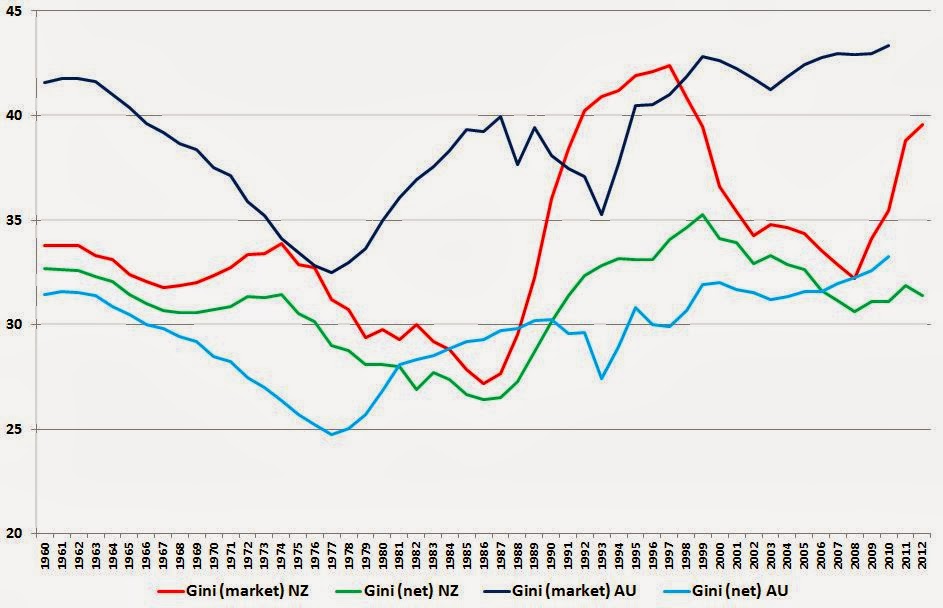
Here's just over 50 years (1960-2012) of income inequality in New Zealand, as summarised by the Gini coefficient, in two flavours - one based on market incomes, and one (arguably the more important one) based on net incomes after the impact of tax and transfers. As you'd expect, the post-tax, post-transfer level of inequality (green line) is less than the pre-tax pre-transfer level (red line) because of the progressive nature of the combined tax and transfer system.

You can see the trends for yourself. Eyeballing the thing, the only vaguely analytical comment I'd make is that the tax/transfer system didn't seem to be very strongly redistributive up to the mid 1980s, though my memory of it was of very high marginal tax rates back then, but it obviously had a much larger redistributive impact in the 1990s. The SWIID database includes an estimated percentage reduction in market income inequality due to taxes and transfers: in the mid 1970s it was about 7-8% of the pre-tax inequality, but in the mid 1990s it was more like 18-20%.

Out of idle curiosity I wondered what had happened across the ditch, so here are the same two Kiwi Gini coefficients (still red and green), plus their Aussie equivalents (darker and lighter blue).
The Economist's Free Exchange column last week had an article (based on IMF working papers) on 'Inequality v growth' that has got a lot of coverage, partly because of its conclusion that "Up to a point, redistributing income to fight inequality can lift growth". It's been picked up locally: Brian Fallow at the Herald can always be relied on to be up with the play, and has been again with his article today, 'Playing politics with poverty hides truth', with the (characteristically) evenhanded assessment that "Both the Left and Right are too quick to push ideas about inequality that don't stand up to scrutiny". And various local bloggers have also been on the case, including Anti-Dismal, Groping towards Bethlehem, and The Visible Hand in Economics.
I have to admit that income inequality in New Zealand is not anything I've looked at closely before, and I'd never consulted the Standardised World Income Inequality Database, or SWIID, created by Professor Frederick Solt at the University of Iowa, which has provided the basis of much of the recent analysis of links between inequality and other economic outcomes. You probably haven't either, so I thought it might be useful to lay out the bare facts of what the data show. People can argue about causes and consequences afterwards.
Here's just over 50 years (1960-2012) of income inequality in New Zealand, as summarised by the Gini coefficient, in two flavours - one based on market incomes, and one (arguably the more important one) based on net incomes after the impact of tax and transfers. As you'd expect, the post-tax, post-transfer level of inequality (green line) is less than the pre-tax pre-transfer level (red line) because of the progressive nature of the combined tax and transfer system.
You can see the trends for yourself. Eyeballing the thing, the only vaguely analytical comment I'd make is that the tax/transfer system didn't seem to be very strongly redistributive up to the mid 1980s, though my memory of it was of very high marginal tax rates back then, but it obviously had a much larger redistributive impact in the 1990s. The SWIID database includes an estimated percentage reduction in market income inequality due to taxes and transfers: in the mid 1970s it was about 7-8% of the pre-tax inequality, but in the mid 1990s it was more like 18-20%.
Gini coefficients aren't the only way to look at inequality: if your interest lies in what's happening at the megarich end of the income distribution, the SWIID also includes the share of pre-tax income going to the top 1% of taxpayers. Here are those results: they show broadly the same overall pattern.
Out of idle curiosity I wondered what had happened across the ditch, so here are the same two Kiwi Gini coefficients (still red and green), plus their Aussie equivalents (darker and lighter blue).
No doubt everyone will see the patterns they want to: for what it's worth, I'd conclude that, in general, the Aussies have more unequal market incomes than we do, but their tax/transfer system is generally a lot more redistributive, so the net Gini coefficients aren't too different. There are timing differences: inequality (gross and net) started rising in Australia a good decade before it did here. And there's a difference of substance: inequality is still likely rising in Australia (though their data stop at 2010), whereas at least on a net basis it's heading down here at home (I wonder what's caused that fairly sharp rise in market inequality in the last couple of years in NZ?).
A hopefully helpful technical note: if you download the SWIID data to have a look yourself, you'll find yourself starting here. Where it says '2. Data', check the box beside 'SWIIDv4_0.zip'. When you've downloaded the zip file and unzipped it, you'll find that the data is mostly designed for two statistical packages, Stata and R, but do not despair if (like me) you're only going to use Excel. In the directory you've unzipped into, you'll find an Excel-compatible .csv file called SWIIDv4_0summary, and you're home free. By the way, for some mysterious reason there are no NZ values for 1961, so in the chart above comparing NZ and Australia I've created 1961 by averaging 1960 and 1962.
Wednesday 5 March 2014
Wrong, wrong, wrong, wrong, wrong
Let me preface what I'm going to say next, by pointing out that I keep this blog non-partisan and non-political, that I'm only interested in the intellectual substance of economics and public policy, and that I couldn't care less about the inanity of political point-scoring.
I do want to comment, though, on the substance of some potential telco policy ideas that were apparently leaked from Clare Curran's office. As I say, I don't care in the least who penned them, who leaked them, or how or why, and I'd have the same reaction to them no matter who wrote them.
According to the NBR's coverage, "In very broad terms, the [leaked] document hints at more regulation, stating: Platform infrastructure competition is wasteful and anti-competitive. It needs to be open access, regulated for maximum competition and run as a single platform monopoly" (bold lettering in the NBR original).
This is as wrong as any infrastructural policy could possibly be. If you rewrote it as its complete opposite - "Platform infrastructure competition drives efficiencies and is strongly pro-competitive" - you'd be on the right track.
The only reason that we have even half-way acceptable airline services is because Jetstar now, and Ansett before, rolled out their own infrastructure platforms to compete with Air New Zealand.
The only reason we have even half-way acceptable mobile phone services is because Vodafone first, and 2degrees later, rolled out their own infrastructure platforms to compete with Telecom.
The only reason we have even half-way acceptable stuff to watch on our televisions is because Sky TV ran out its own infrastructure platform to compete with the "free to air" channels.
Or put it the other way.
A major reason why airports, for example, are attracting regulatory attention is precisely because they have not faced infrastructural competition. The first best answer, if Auckland or Wellington airports are ripping us off, is to encourage or allow a second Auckland airport (Whenuapai?) or a second Wellington airport (Paraparaumu?) to keep the incumbents honest. Consumers (passengers and airlines) get better choice, and the incumbents have to keep their costs and charges under control.
And finally: the amount of competition that can occur between rivals sharing the same infrastructure is self-evidently minor compared to the amount of competition that occurs between rivals deploying their own assets.
Wrong analysis, wrong diagnosis, wrong response.
How to get rich
Yesterday the Productivity Commission sponsored a Government Economics Network seminar, 'Reallocation and Productivity', presented by the University of Toronto's Diego Restuccia. It's not the most revealing of titles, but if you read the abstract of the speech you'll see it actually deals with one of the most fundamental issues in economics - "What explains why some countries are rich and others poor?"
My summary of Restuccia's analysis is that the richest countries have gone through a series of sectoral reallocations - first realising the large productivity gains that are typically available in the very inefficient (often subsistence level) agricultural sectors of poor economies; then using the freed-up resources to realise the large productivity gains possible in manufacturing; and last in the piece, shifting resources into the services sectors that typically dominate activity in a modern economy. For more developed economies, aiming say at the living standards of a US, "productivity in the services sector is the most pressing issue" (quoting from the abstract), which explains the Productivity Commission's involvement, given that it is now well-advanced with its inquiry into 'Boosting services sector productivity'.
Restuccia also splits the services sector into two - what he calls a "traditional" services sector, which is often non-market and non-tradable (education, health) and a subsequent "non-traditional" or "modern" one, which tends to be market-based and tradable (think entertainment, media, sports, culture, IT). If you're going to have the living standards of a US, you're going to have to be able to cut it in those modern services sectors.
There's nothing inevitable about this sequential process: policies, institutions and culture can assist or retard it. Some countries never get started, for example, or even become even poorer subsistence economies. Some rattle through the process at a great rate (China, for example). And his data showed that some countries may have done the agriculture thing, and the manufacturing thing, but haven't been able to go on and do the services thing, or have achieved some of these gains, but then have given them up again (Argentina being a long-standing example that always figures in these sorts of analyses, while some of the peripheral Eurozone economies are more recent cases). New Zealand, arguably, is making heavy weather of the services transition, too.
One important characteristic of this process is that at any point in time, there tends to be a very wide dispersion of performance across any given sector, so development tends to be a combination of advancing up the chain from one sector to another but also of reallocation of resources from least productive to more productive entities within each sector. The productivity gains from having resources within a sector used by the most efficient businesses can be immense: conversely, policies that prevent or impede resources moving to their best use within each sector have the potential to seriously gummage up the whole process.
Thought-provoking stuff, in sum, and if you'd like to hear more of it, Restuccia is presenting what I'd guess will be much the same again, at the Southern Workshop in Macroeconomics at the University of Auckland on Friday.
Monday 3 March 2014
Information Disclosure 101
I've just got an e-mail from Genesis Energy, saying, "Your electricity prices are changing".
Like everyone else who gets one of these announcements, I had that sinking feeling that "changing" would be corporate weaselspeak for "going up".
But when I went through it, on a back of an envelope calculation it looks like our household is going to be pretty much all square compared to last year's prices. Our fixed daily charge is going up by a stonking 79% or so (from $1.00 a day to $1.7856) but the unit cost of our electricity is going down by just over 15% (from 21.98 cents per kWh to 18.67 cents). Eyeballing the little histogram of daily usage over the past year that came with our last bill, I reckon we use about 25 units a day over a full year, so last year's bill was about $195/month ($30 fixed and $165 variable) and this year's looks like $194/month ($54 fixed and $140 variable). Same diff.
But why on earth do I have to go through all this palaver to find out?
We have information disclosure regimes all over the damn place, and not a single one of them tells me what I actually want to know: on last year's consumption, how will my bill this year, at these new prices, compare with my bill at last year's prices?
What are information disclosure regimes for, if they aren't designed to answer the simplest consumer questions of all?
Saturday 1 March 2014
It's free!
The Journal of Economic Perspectives, that is. It was virtually free before - it came automatically (with online access) as part of your membership of the American Economic Association, which is US$20-40 a year - but now it's available to anyone, anywhere, for nothing. Including all the back issues (it started in 1987).
A great move, for an excellent publication that's designed to be topical, and accessible to the intelligent layperson, without compromising the intellectual quality of the economic arguments. And hopefully it's yet another little chink in the dyke of the profiteering academic publishing racket.
Maybe I should have noticed this free access myself, but I can't say I'm terribly diligent at following up on the AEA's activities (and when, by the way, are they going to move from their Stalinist one-candidate-for-AEA-president 'elections'?), so credit for drawing my attention to it goes to the Managing Editor of the JEP, Timothy Taylor, who mentioned it in this post on his (very readable) blog, Conversable Economist.
And apart from doing all that good stuff, Taylor also writes the 'Recommendations for Further Reading' part of the JEP ("readings that may be especially useful to teachers of undergraduate economics, as well as other articles that are of broader cultural interest. In general, with occasional exceptions, the articles chosen will be expository or integrative and not focus on original research"), which is a great resource for all of us who don't have the time to troll all through the latest papers at the SSRN or at the IZA. His latest recommendations are here.
Wrong answers to an interesting question
It's not the best known of surveys, but every quarter the Reserve Bank carries out a survey of expectations across a reasonably broad cross-section of respondents (mostly financial sector types, including me, making 35 of the latest respondent group of 72, but also 19 from business, 8 from agriculture, 3 from labour groups and 7 miscellaneous). So it's a useful complement to the economists-only consensus forecasts compiled by the NZIER.
You can see the RB's latest results here. The Bank's main interest is, as you'd expect, the behaviour of inflation expectations, which are tracking as shown in the graph below. It also collects views on GDP growth and unemployment (the cycle is getting ever stronger), earnings growth (modest), bill and bond yields (expected to rise), and the NZ$/US$ and NZ$/A$ exchange rates (no great change expected).

There is one small flaw in the survey, however. The Bank asks people for their perceptions of the stance of monetary policy on a scale from very loose to very tight, and turns the answers into an index number: the latest result is shown below. As you can see, people are answering that monetary conditions are remarkably easy.

But they're not, of course, and if you've come across this survey before and took this graph at face value, you'd have been misled. As I said a wee while back, overall monetary conditions reflect the combined impact of both interest rates and the exchange rate (and arguably other factors too, such as ease of access to credit or equity). If you go back over the past few years and graph the Monetary Conditions Index, which takes both interest rates and the exchange rate into account, against the RB survey measure of what monetary conditions feel like, you get the result below (I've estimated the Mar '14 MCI at current bank bill and TWI levels).

The reality, in short, is that overall monetary conditions, far from being unusually easy (as assessed by the survey) are in fact heading for levels that are quite stringent by historical standards (going by the MCI).
What's happening, unfortunately, is that respondents are actually supplying their estimate of whether interest rates are unusually low or unusually high.
Maybe the RB is able to make some other use of the answers, but they're not good answers to the question the Bank was actually asking.
You can see the RB's latest results here. The Bank's main interest is, as you'd expect, the behaviour of inflation expectations, which are tracking as shown in the graph below. It also collects views on GDP growth and unemployment (the cycle is getting ever stronger), earnings growth (modest), bill and bond yields (expected to rise), and the NZ$/US$ and NZ$/A$ exchange rates (no great change expected).
There is one small flaw in the survey, however. The Bank asks people for their perceptions of the stance of monetary policy on a scale from very loose to very tight, and turns the answers into an index number: the latest result is shown below. As you can see, people are answering that monetary conditions are remarkably easy.
The reality, in short, is that overall monetary conditions, far from being unusually easy (as assessed by the survey) are in fact heading for levels that are quite stringent by historical standards (going by the MCI).
What's happening, unfortunately, is that respondents are actually supplying their estimate of whether interest rates are unusually low or unusually high.
Maybe the RB is able to make some other use of the answers, but they're not good answers to the question the Bank was actually asking.
Subscribe to:
Posts (Atom)